James Tovell NEA brief
Tuesday, 17 April 2018
Final evaluation


Here are my 4 final products that I have created and finalised. In my statement of intent I stated that i was going to use card stacking in a bid to make my product more interesting. This can be seen with statements throughout my final products such as "smell better, feel better". this is an example of card stacking as just because you smell better you will not necessarily feel better although it may encourage people to consider my product. I have also used plain folks when deciding on my models as I have already stated that I want the audience to be able to relate to my product and by using plain folks, it may connect to people more as they are ordinary people like you and I. Finally I have also stuck to the plan of using a catchy slogan. After creating a few ideas that i could use as a slogan, I decided to go with "FOR HIM, FOR HER, FOR EVERYONE". It is very simple and creates a repetitive feel with the repetition of "FOR" followed by a word. It also promotes the idea of being gender neutral and encourages all people to come and try out my product.
My statement of intent stated that I wanted to use bright colours in a bid to portray a happy, feel good feeling. I have attempted to do this by using the gender neutral colour of turquoise which brightens up the image. I have also tried to portray young adults in a different light to the stereotypical troublemaker who is always causing chaos and being rude. I have tried to achieve this by having my models hug and be generally friendly. In my posters I wanted to create a similar feel to all of them of urbanism and streets as it is easily relatable. I have done this using specific backgrounds such as brick walls and metal steps to create a relatable feel that depicts a realistic impression of what the world actually looks like rather than sunshine and rainbows and brushing over reality.
Location reports
This is the location I will be shooting at. It is Harlow College located at Velizy Ave, Harlow CM20 3EZ. The reason I chose to shoot here is because it is local and I know my way around so I would be able to find the best possible areas. It also links to my target audience which is 16-25. This is because it is a college full of this age group and it is where the youth go so it is relatable.
For this shoot I intent to use a camera and i may have a tripod ready incase I need to use it. I will also need my Student Card to get into the building. The tripod may be a hazard while it is unused and left on the floor so I will take extra caution to make sure that it is out of the way while I am taking my shoots.
Audience research
Summary
This survey was completed by 10 respondents with 100% of them aged between 16-25 and a 60:40 split between females and males. This data shows that my research is highly relevant to my target audience which means that I will get the best feedback possible.
When asked "which advert do you prefer?", an overwhelming 77.78% said that they preferred the first image. This may have something to do with the text colour as 100% of respondents said they preferred the blue text over the black. This suggests that the initial image and editing of the second image may be better however it could have been let down with the text colour. One reason they may not have liked the black text is because "you cant see it as well" which was the majority of improvements listed in the last question. A key concern of mine initially was whether "24 hour protection" was a good selling point as I wasn't sure whether it would actually influence peoples decision when choosing a deodorant however all of my respondents agreed that it was so I have decided to include it on my final label design. I also wanted to know if it was worth putting social media links on my adverts so i asked the question and most respondents (80%) felt like they were good for reaching out to my target audience. Finally I asked whether my adverts as a whole appealed to 16-25 year olds and 60% agreed while 30% strongly agreed. That means that 10% (1 person) disagreed however I could count this as an anomaly on the bases that somebody may not have been serious when taking my survey.
When asked how my adverts could be improved, one respondent said "A good slogan, more colour, big font" while another said that "its a bit simple". This tells me that perhaps my final adverts should showcase a bit more colour and less negative space.
Main image

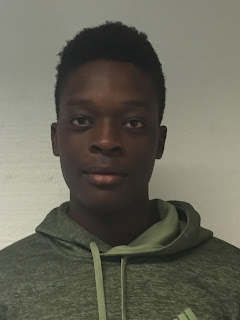
Here are my 4 images i have chosen to use as research for my own pictures. I have tried to include a mix of formal and informal photos to appeal to a wider range of people. I have edited two of them myself to get an even better idea of what my products will potentially look like and to get a better understanding of what I may need to look out for such as negative space. For my last photo I have used a graffiti background in a way that doesn't send out the wrong message as its done in an artistic way which I was very careful about. This is there to appeal to the 'youth' and the younger end of the target age group.
Subscribe to:
Comments (Atom)
-
This is the location I will be shooting at. It is Harlow College located at Velizy Ave, Harlow CM20 3EZ. The reason I chose to sh...
-
Here are my 4 images i have chosen to use as research for my own pictures. I have tried to include a mix of formal ...


